Website, UX/UI
Back to School - Web Page
ROLE
Product Designer
TEAM
Omar Achkar (Developer)
TOOLS
Figma, Loom
STATUS
Completed
Product Designer
TEAM
Omar Achkar (Developer)
TOOLS
Figma, Loom
STATUS
Completed
PROJECT OVERVIEW
Development of web page to attract leads into CLS Health service lines related to children and teenage health. The theme of the web page was centered around back-to-school in time for school season. Targeted user audience geared towards teachers/coaches, parents, and guardians of student-age children.
Development of web page to attract leads into CLS Health service lines related to children and teenage health. The theme of the web page was centered around back-to-school in time for school season. Targeted user audience geared towards teachers/coaches, parents, and guardians of student-age children.
OBJECTIVE
Children health awareness
A refreshed approach for raising awareness on children health was discussed to better market specialty service lines that supported pediatrics including primary care, eye care, nutrition, and sports medicine. Checklist of health checkups is provided for user convenience suggesting a complete line-up of services to seek per specialty.
IDEATE
Content of the web page was categorized into primary information (blue in wireframe) and supplementary information (magenta in wireframe). Supplementary content is filled in between primary sections to act as transitional space. These “buffer” spaces reduce cognitive load while keeping users engaged throughout the entire scroll. The UI of the web page layers white and brand color backgrounds to visually break content.
Information Architecture & UI Application
Content of the web page was categorized into primary information (blue in wireframe) and supplementary information (magenta in wireframe). Supplementary content is filled in between primary sections to act as transitional space. These “buffer” spaces reduce cognitive load while keeping users engaged throughout the entire scroll. The UI of the web page layers white and brand color backgrounds to visually break content.


DESIGN
Sections (also known as ”slices” in our CMS system) for primary and CTA content diversely utilize multiple UI system such as cards, tabs, and expandable accordions that best display each information while keeping content space-efficient.
Primary sections
Sections (also known as ”slices” in our CMS system) for primary and CTA content diversely utilize multiple UI system such as cards, tabs, and expandable accordions that best display each information while keeping content space-efficient.
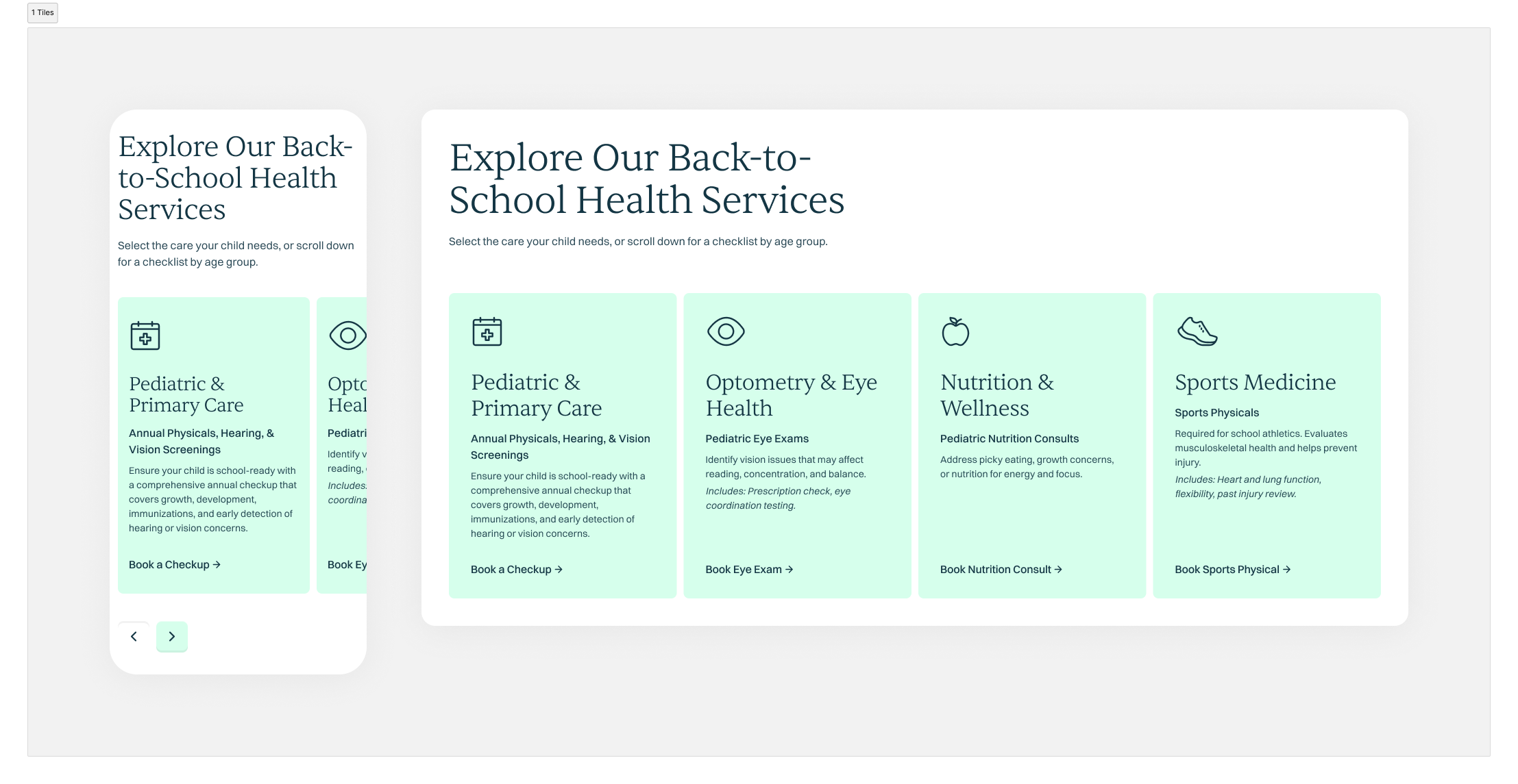
Offered service cards
Cards for each offered service clarify scope of care related to children and back to school events. Users don’t have to guess which providers to look for and can directly book through the CTA on each card.
Cards for each offered service clarify scope of care related to children and back to school events. Users don’t have to guess which providers to look for and can directly book through the CTA on each card.
Filterable tabs by ages
Checklist for health checkups by each specialty is broken down by tabs for each age group. This reduces scanning time and allow users to fast-track to relevant information that applies to them. Tabs also allow to save scrolling space, especially in mobile, as a more space-efficient alternative than to stack the content.
Checklist for health checkups by each specialty is broken down by tabs for each age group. This reduces scanning time and allow users to fast-track to relevant information that applies to them. Tabs also allow to save scrolling space, especially in mobile, as a more space-efficient alternative than to stack the content.

Unique selling points
Key differentiators are stated and present unique selling points as a comprehensive clinic that offers one-stop-for-all care. Value proposition is consolidated and amplifies trust from users.
Key differentiators are stated and present unique selling points as a comprehensive clinic that offers one-stop-for-all care. Value proposition is consolidated and amplifies trust from users.

Filterable provider list tabs by specialty
Providers are listed, sorted by specialty tabs, that then call to action for users to book with the provider of their choice and anchor direct paths to their wanted specialty.
Providers are listed, sorted by specialty tabs, that then call to action for users to book with the provider of their choice and anchor direct paths to their wanted specialty.

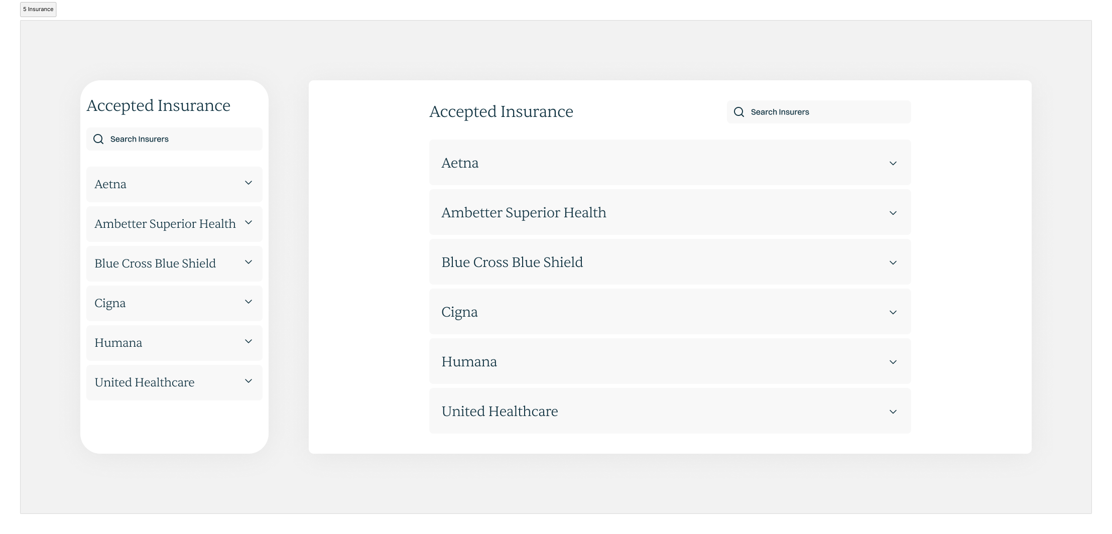
Expandable accordions by insurance
One of the top booking objection involves users’ insurance coverage. By listing out information proactively through expandable accordions, this eliminates a major hesitation and friction point that could prevent users from booking.
One of the top booking objection involves users’ insurance coverage. By listing out information proactively through expandable accordions, this eliminates a major hesitation and friction point that could prevent users from booking.
PROTOTYPE
Filterable Tabs
Filterable tabs for checklists and provider lists was a new “slice” that had to be developed from scratch as it was not in the current stack of slices in our CMS. The slice design was prototyped in figma to give accurate understanding of its animation for development hand-off.
