UX/UI
CLS Health Design System
ROLE
Product Designer
TEAM
Omar Achkar (Developer)
TOOLS
Figma, Illustrator
STATUS
Ongoing
Product Designer
TEAM
Omar Achkar (Developer)
TOOLS
Figma, Illustrator
STATUS
Ongoing
PROJECT OVERVIEW
Created the design system of CLS Health website product to hub all components and establish design standards and usage guidelines. Possessing an in-house design system led to faster development time, consistent design, and improved interaction and flow across the product. Starting a design system now was crucial as the company was growing at a fast pace and the team would have to eventually house more designers. It would serve as a central hub for all design documentation and guidelines that can expand and modify accordingly to the company growth and multiple designers’ involvement.
Created the design system of CLS Health website product to hub all components and establish design standards and usage guidelines. Possessing an in-house design system led to faster development time, consistent design, and improved interaction and flow across the product. Starting a design system now was crucial as the company was growing at a fast pace and the team would have to eventually house more designers. It would serve as a central hub for all design documentation and guidelines that can expand and modify accordingly to the company growth and multiple designers’ involvement.
PROBLEM
CLS Health website did not have any defined design standards along with usage guidelines of components. A thorough audit of the website was performed to discover all of existing design and animation patterns. Inconsistent and overload of varying design applications were discovered across both desktop and mobile. Communications with developer was also being hindered as mockups and prototypes were not being produced due to missing components or template pages to base new designs. This prolonged development time even on simple design changes and updates.
Missing design foundation & communication
CLS Health website did not have any defined design standards along with usage guidelines of components. A thorough audit of the website was performed to discover all of existing design and animation patterns. Inconsistent and overload of varying design applications were discovered across both desktop and mobile. Communications with developer was also being hindered as mockups and prototypes were not being produced due to missing components or template pages to base new designs. This prolonged development time even on simple design changes and updates.
GOAL
The design system will house every reusable components of all sizes, documenting it in every scale and responsive screen size. Description of purpose, guidelines of usage, and variants (if any) are also written out and documented to keep with consistent use across the website product. Having a library of product components will allow to easily source and pull for design mockups that will provide clearer communication and expectations to developer and eliminate back-and-forths and multiple iterations.
Consistent design & speedier production
The design system will house every reusable components of all sizes, documenting it in every scale and responsive screen size. Description of purpose, guidelines of usage, and variants (if any) are also written out and documented to keep with consistent use across the website product. Having a library of product components will allow to easily source and pull for design mockups that will provide clearer communication and expectations to developer and eliminate back-and-forths and multiple iterations.
DEFINE
First step needed in the process was laying out the basic foundation that the design system is building off of. A diagnosis of discovering all sizing and spacing on the website was studied and the most common unit system in place was in by 8px increments. Sizing and spacing of elements were more clearly defined using the 8px unit system and corner radius was also established to be used at 8px. Brand colors were also further specified on where-to-use and categorized to what was primary, secondary, tertiary, etc. Heading and body text fonts are also noted along with the different font sizes and weights that must be used in conjunction as one setting.
Determine design system basis
First step needed in the process was laying out the basic foundation that the design system is building off of. A diagnosis of discovering all sizing and spacing on the website was studied and the most common unit system in place was in by 8px increments. Sizing and spacing of elements were more clearly defined using the 8px unit system and corner radius was also established to be used at 8px. Brand colors were also further specified on where-to-use and categorized to what was primary, secondary, tertiary, etc. Heading and body text fonts are also noted along with the different font sizes and weights that must be used in conjunction as one setting.

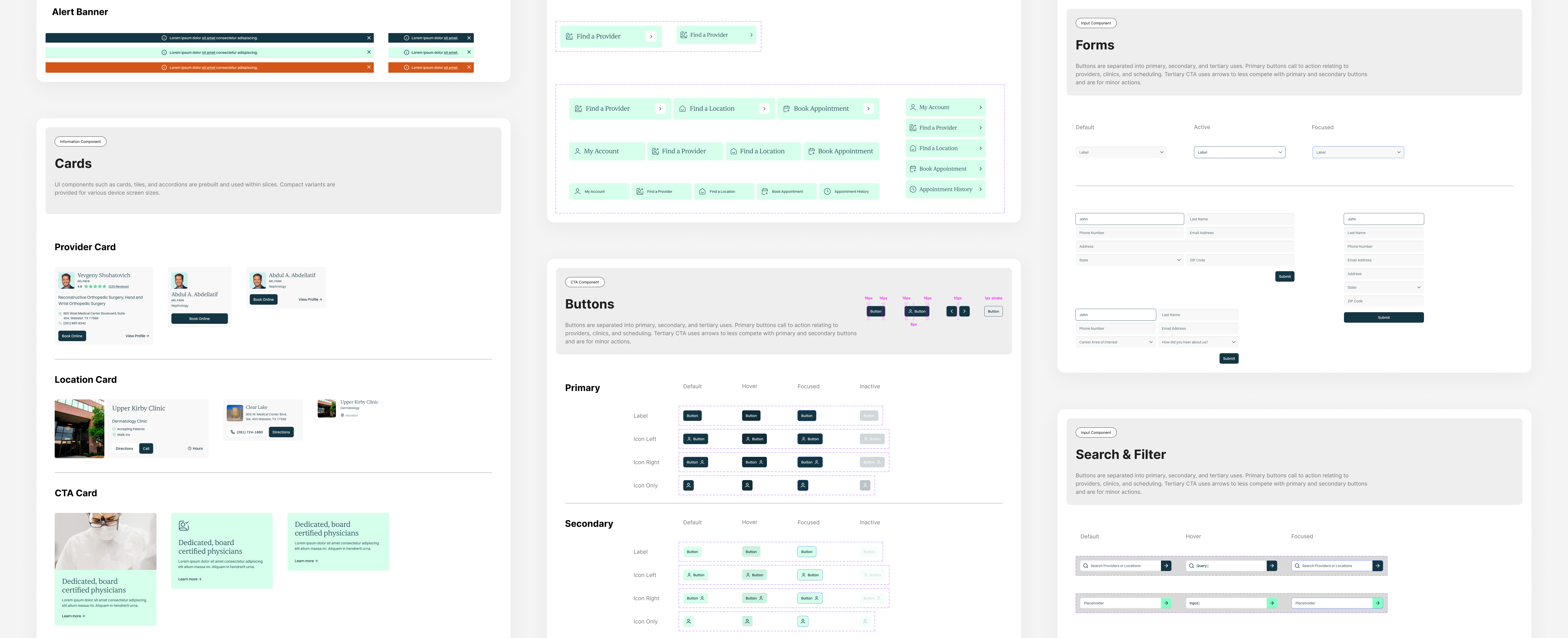
CREATE
Components are organized from micro to macro systems using atomic design methodology. Elements are broken down to smallest matters such as icons, logos, butons, and texts. These matters then gets combined and form into more operational elements that is used at large. Templates and page examples put these elements into real action on how content is positioned in place.
Atomic Design Methodology
Components are organized from micro to macro systems using atomic design methodology. Elements are broken down to smallest matters such as icons, logos, butons, and texts. These matters then gets combined and form into more operational elements that is used at large. Templates and page examples put these elements into real action on how content is positioned in place.


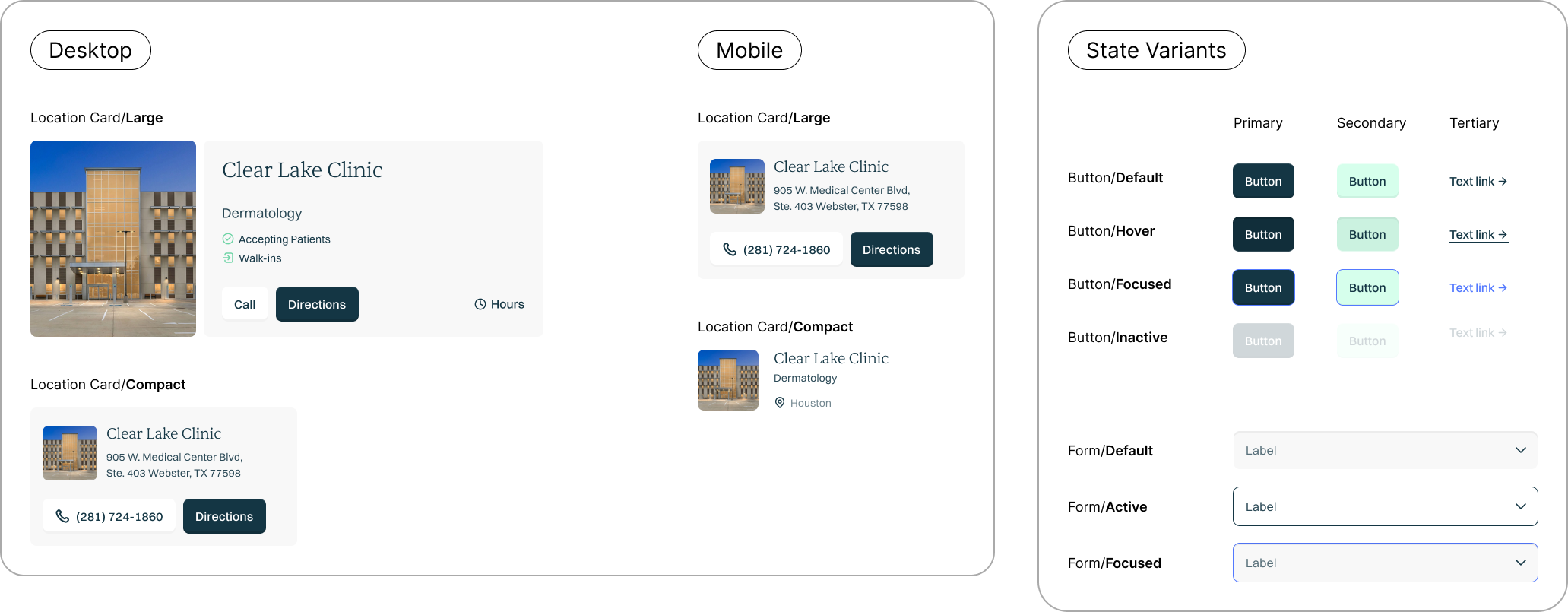
REFINE
Component documentation is further refined through detailed breakdown of any variant forms. A holistic collection of all variants is documented that vary in size or state including desktop/mobile, large/compact, and default/hover/active/inactive/focused.
Variants
Component documentation is further refined through detailed breakdown of any variant forms. A holistic collection of all variants is documented that vary in size or state including desktop/mobile, large/compact, and default/hover/active/inactive/focused.
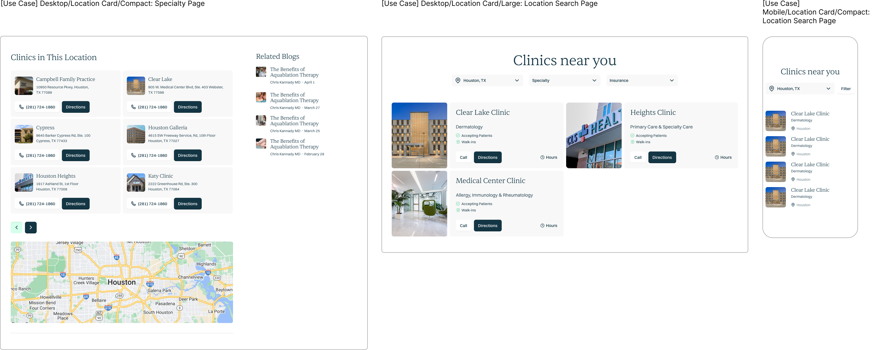
Use cases of each variant are shown below to provide real examples on how and when different variants should be used accordingly to device screen and/or page types. Use cases will better guide and inform how each variant is adaptive to it’s intended use across different screen sizes.
IMPLEMENT
In order to make development and design application more efficient, tokens were introduced to determine single sources of truth that could be applied everywhere across the product. Tokens would allow for designers to avoid repeatedly defining hex code values and developers to avoid hardcoding styles. This will greatly speed up implementation and ensure feasible update if a color or font was to change as value could just be swapped and be instantly reflected where its applied. Inconsistencies will significantly reduce and design can remain future-proof to adapt to any changes.
Design Tokens
In order to make development and design application more efficient, tokens were introduced to determine single sources of truth that could be applied everywhere across the product. Tokens would allow for designers to avoid repeatedly defining hex code values and developers to avoid hardcoding styles. This will greatly speed up implementation and ensure feasible update if a color or font was to change as value could just be swapped and be instantly reflected where its applied. Inconsistencies will significantly reduce and design can remain future-proof to adapt to any changes.

REFLECT
The design system is still a working progress and will remain to ever-evolve with new updates, changes, and releases. CLS Health website gets large traffic every month and the company is only projected to grow at a fast pace with more designers to join in the future. Therefore, I knew it was critical to get a design system file started and going at this time while the existing website was still new and manageable. With new design updates later down the road, documenting version history will be thought out and implemented to precisely record all phases of design.
Into the future
The design system is still a working progress and will remain to ever-evolve with new updates, changes, and releases. CLS Health website gets large traffic every month and the company is only projected to grow at a fast pace with more designers to join in the future. Therefore, I knew it was critical to get a design system file started and going at this time while the existing website was still new and manageable. With new design updates later down the road, documenting version history will be thought out and implemented to precisely record all phases of design.