UX/UI
Clinic Locator
ROLE
Product Designer
TEAM
Omar Achkar (Developer)
TOOLS
Figma, Snazzy Maps, Google Maps API, VWO
STATUS
Completed
Product Designer
TEAM
Omar Achkar (Developer)
TOOLS
Figma, Snazzy Maps, Google Maps API, VWO
STATUS
Completed
PROJECT OVERVIEW
The CLS Health website’s specialty pages struggled to provide users in finding which clinic locations offered their search of specialty. Without a clear list or map of clinics, users had to leave the site to search manually (Google Maps, Apple Maps, etc.), often leading to confusion and drop-offs before booking an appointment. Clinic Locator was designed to allow users to easily view, filter, and map all clinics associated with a specific specialty — directly within the specialty page. The goal was to simplify the path from exploring care options to scheduling a visit.
The CLS Health website’s specialty pages struggled to provide users in finding which clinic locations offered their search of specialty. Without a clear list or map of clinics, users had to leave the site to search manually (Google Maps, Apple Maps, etc.), often leading to confusion and drop-offs before booking an appointment. Clinic Locator was designed to allow users to easily view, filter, and map all clinics associated with a specific specialty — directly within the specialty page. The goal was to simplify the path from exploring care options to scheduling a visit.
PROBLEM
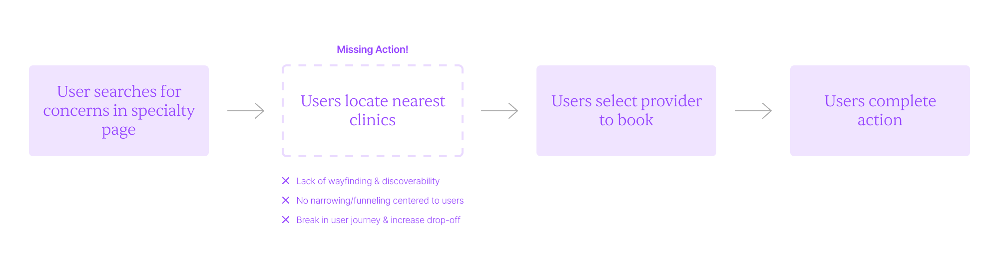
Patients visiting the specialty pages were unable to easily locate nearby clinics that offered the services they needed. Each specialty page provided only general introduction, providers, and insurance information without showing which clinic locations offered that specialty. This vague search earlier on the journey caused drop-offs before booking appointments and friction in transferring users to the next step in completing the end-goal action.
Vague searching
Patients visiting the specialty pages were unable to easily locate nearby clinics that offered the services they needed. Each specialty page provided only general introduction, providers, and insurance information without showing which clinic locations offered that specialty. This vague search earlier on the journey caused drop-offs before booking appointments and friction in transferring users to the next step in completing the end-goal action.
DESIGN
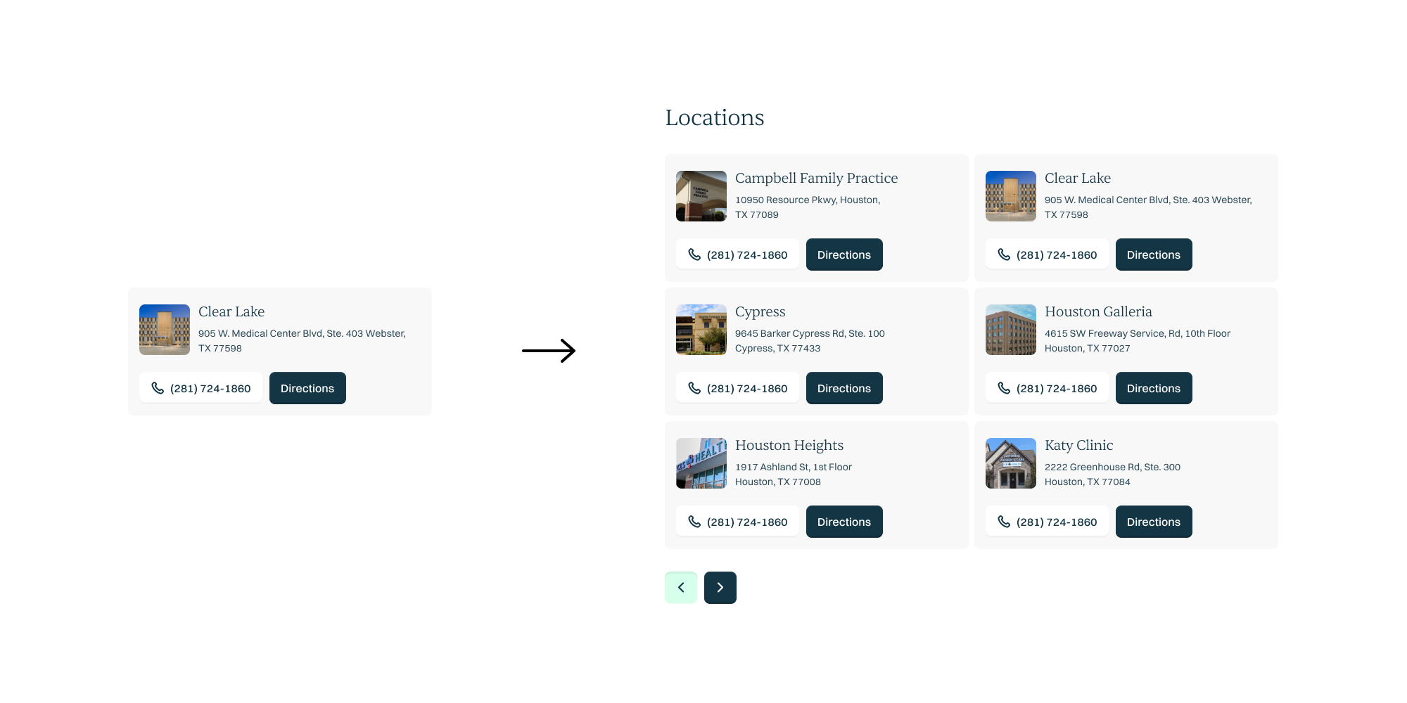
Taking from the design system, the provider card design was reinvented and tailored to focus on location information. Location cards were then listed out for users to directly look for clinics that best fit their booking convenience.
Location Cards List & Map
Taking from the design system, the provider card design was reinvented and tailored to focus on location information. Location cards were then listed out for users to directly look for clinics that best fit their booking convenience.
On top of location list, maps were also integrated for easy access to finding clinics near to a user’s point of location. Pop-up component was newly designed while keeping the UI mostly consistent to the cards.
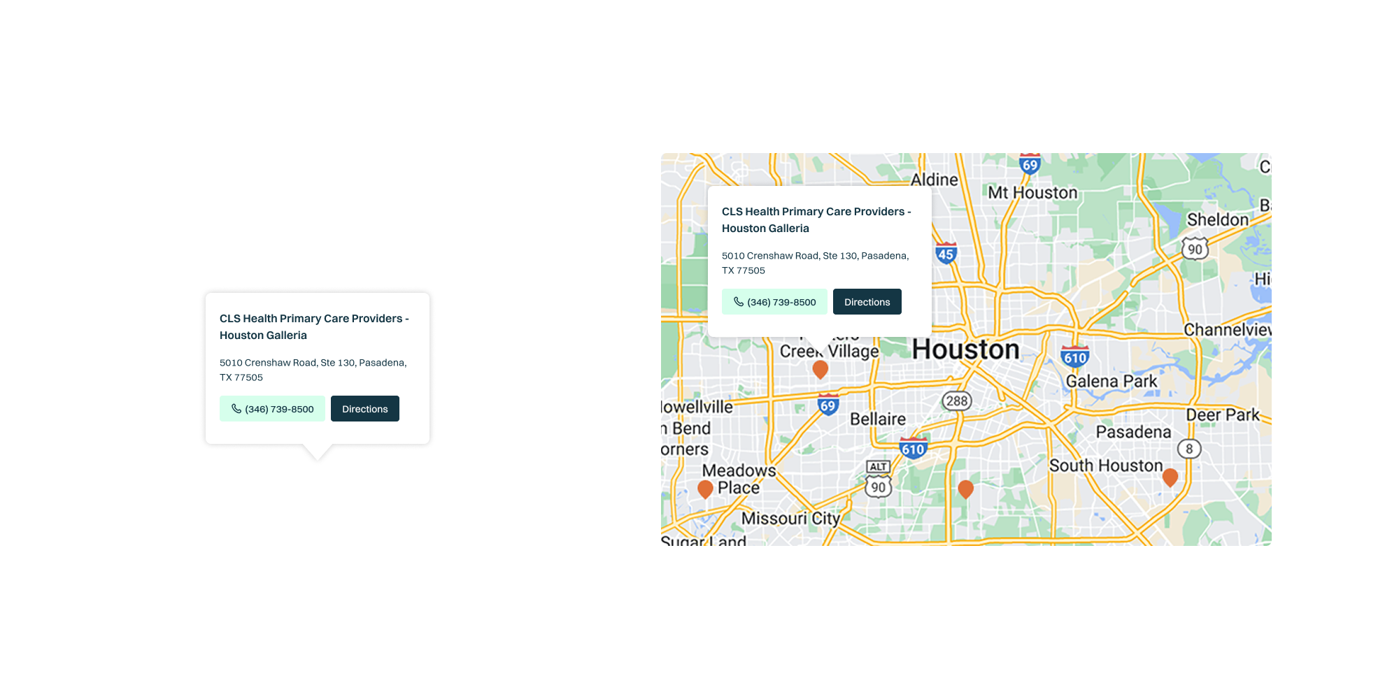
Two different presentation state of clinic locations (list and map) were created and how to display the different modes was the last step in finalizing the feature. Taking advantage of the larger screen territory for desktop, list and map is laid out in side-by-side context for users to easily cross-reference clinic information and geographic spread to determine proximity and wayfinding. By integrating both altogether than implementing toggling,
the feature minimizes task switching and speeds up decision-making.

ITERATION
On smaller screens with tighter real estate, toggle between two modes is implemented and users can choose based on preference and situational needs. Multiple options were created on the design and position of the toggle1. Left option makes users who are majority right-handed convenient to toggle between the two states however, it composed concerns on fat-finger and not giving adequate territory for ease of loose targeting. The selected right option stretches the toggle across the width of the screen and addresses the concerns of fat-finger and optimize mobile real estate for more convenient switch between the two states.
Mobile Toggle
On smaller screens with tighter real estate, toggle between two modes is implemented and users can choose based on preference and situational needs. Multiple options were created on the design and position of the toggle1. Left option makes users who are majority right-handed convenient to toggle between the two states however, it composed concerns on fat-finger and not giving adequate territory for ease of loose targeting. The selected right option stretches the toggle across the width of the screen and addresses the concerns of fat-finger and optimize mobile real estate for more convenient switch between the two states.

Once the toggle wireframe was complete, multiple options were also explored for the UI2 using the primary brand colors, navy and mint. The white state and mint background did not visually create a starker difference to highlight the chosen mode that may not be accessible and all-inclusive for users with vision conditions. Mint state behind a white background worked better to create visual clarity however, the absence of container to group both states make the toggle less unified. Navy state with the neutral gray background achieved the best balance and stability that directed to be the final UI design of the toggle.

IMPLEMENT
Last step in the process was to integrate and set up the feature into the specialty page. ‘Locations’ tab is added into the subnavigation that is then anchored to the feature section for quick and easy navigation.
Page Integration & Navigation Anchor
Last step in the process was to integrate and set up the feature into the specialty page. ‘Locations’ tab is added into the subnavigation that is then anchored to the feature section for quick and easy navigation.

RESULTS
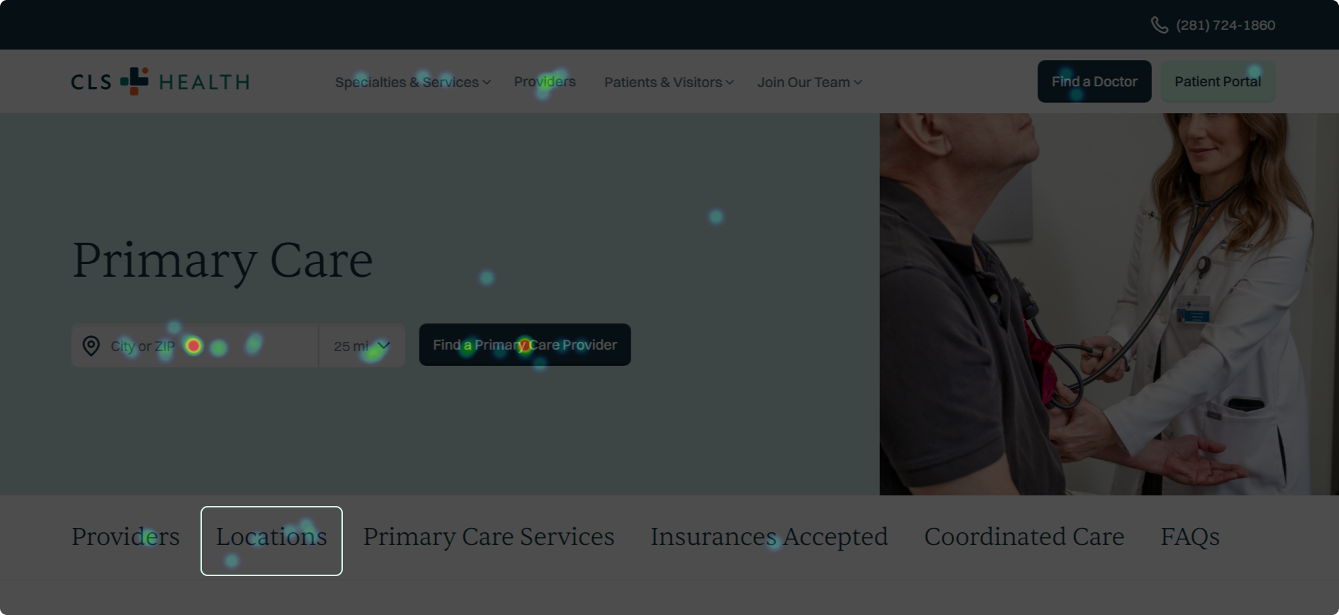
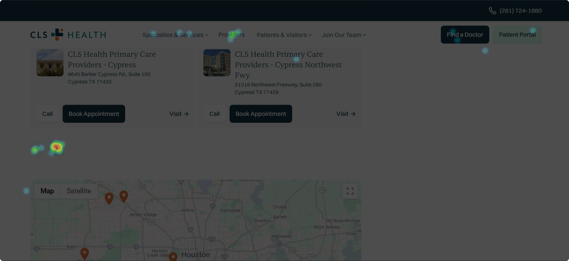
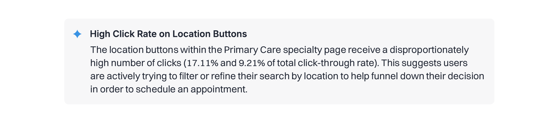
Heatmaps and metrics is being collected on the feature to measure on how it performs and impacts the user experience. Intense heat on clinic locator pagination suggest users cycled through the location card list to actively search based on location. Click rates were also the highest on location buttons that further solidify that location-based UX addition was needed to facilitate the user jouney.
Active refine on search
Heatmaps and metrics is being collected on the feature to measure on how it performs and impacts the user experience. Intense heat on clinic locator pagination suggest users cycled through the location card list to actively search based on location. Click rates were also the highest on location buttons that further solidify that location-based UX addition was needed to facilitate the user jouney.
REFLECT
Further refinements is expected to continue in this feature as more study and research are done on user patterns on interacting with the clinic locator. Possible ideas include implementation of filtering system for the list state to further narrow down clinics in preferred areas of the Houston area.
Next Steps
Further refinements is expected to continue in this feature as more study and research are done on user patterns on interacting with the clinic locator. Possible ideas include implementation of filtering system for the list state to further narrow down clinics in preferred areas of the Houston area.