UX/UI
Provider Card + Journey Update
ROLE
UX Designer
TEAM
Omar Achkar (Developer)
TOOLS
Figma, Hotjar
STATUS
Completed
UX Designer
TEAM
Omar Achkar (Developer)
TOOLS
Figma, Hotjar
STATUS
Completed
PROJECT OVERVIEW
This project aimed to update the UX of our booking process and micro-interaction with provider cards on the specialty pages. Provider details and CTA on the cards were re-thought out to help users to make tailored decision through more diverse, yet shorter paths to book appointments.
This project aimed to update the UX of our booking process and micro-interaction with provider cards on the specialty pages. Provider details and CTA on the cards were re-thought out to help users to make tailored decision through more diverse, yet shorter paths to book appointments.
PROBLEM
A primary way users book appointments is by browsing specialties and viewing provider cards, which show name, credentials, specialty, and two actions: call or view profile. However, online booking action was missing and significant left out users who preferred to book online directly. The lack of clear wording made navigating to profiles unintuitive, and limited details made it hard to compare providers at a glance. Call’ button failed on visibility as the white was indistinctive from the background and its function was stripped when it came to desktop viewing. Lastly, the small specialty label was difficult to read, especially for users with poor eyesight, increasing the chance of skipping providers.
Action-less and disoriented card
A primary way users book appointments is by browsing specialties and viewing provider cards, which show name, credentials, specialty, and two actions: call or view profile. However, online booking action was missing and significant left out users who preferred to book online directly. The lack of clear wording made navigating to profiles unintuitive, and limited details made it hard to compare providers at a glance. Call’ button failed on visibility as the white was indistinctive from the background and its function was stripped when it came to desktop viewing. Lastly, the small specialty label was difficult to read, especially for users with poor eyesight, increasing the chance of skipping providers.


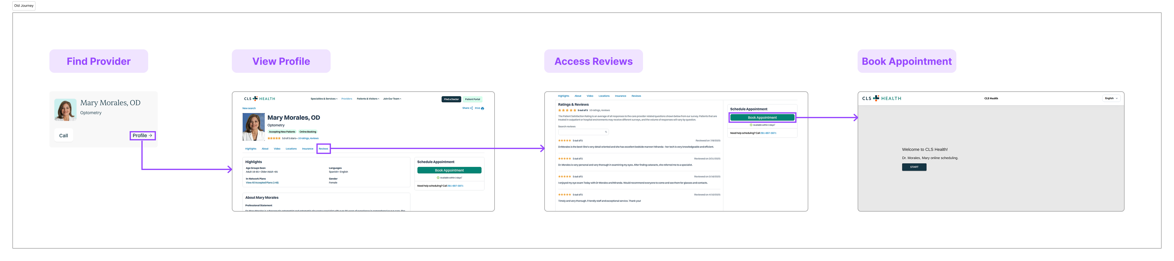
DISCOVERYLengthy journey to book online
Users showed patterns on checking reviews and practicing addresses of providers before choosing who to book with. The old provider card only allowed for one route to book online that involved multiple steps in between to complete the action. The lengthy process increased drop-off rates and slower succeed rates, posing as friction points for users to be on quick path to find and book a provider tailored to their needs.
Lengthy journey to book online
Users showed patterns on checking reviews and practicing addresses of providers before choosing who to book with. The old provider card only allowed for one route to book online that involved multiple steps in between to complete the action. The lengthy process increased drop-off rates and slower succeed rates, posing as friction points for users to be on quick path to find and book a provider tailored to their needs.
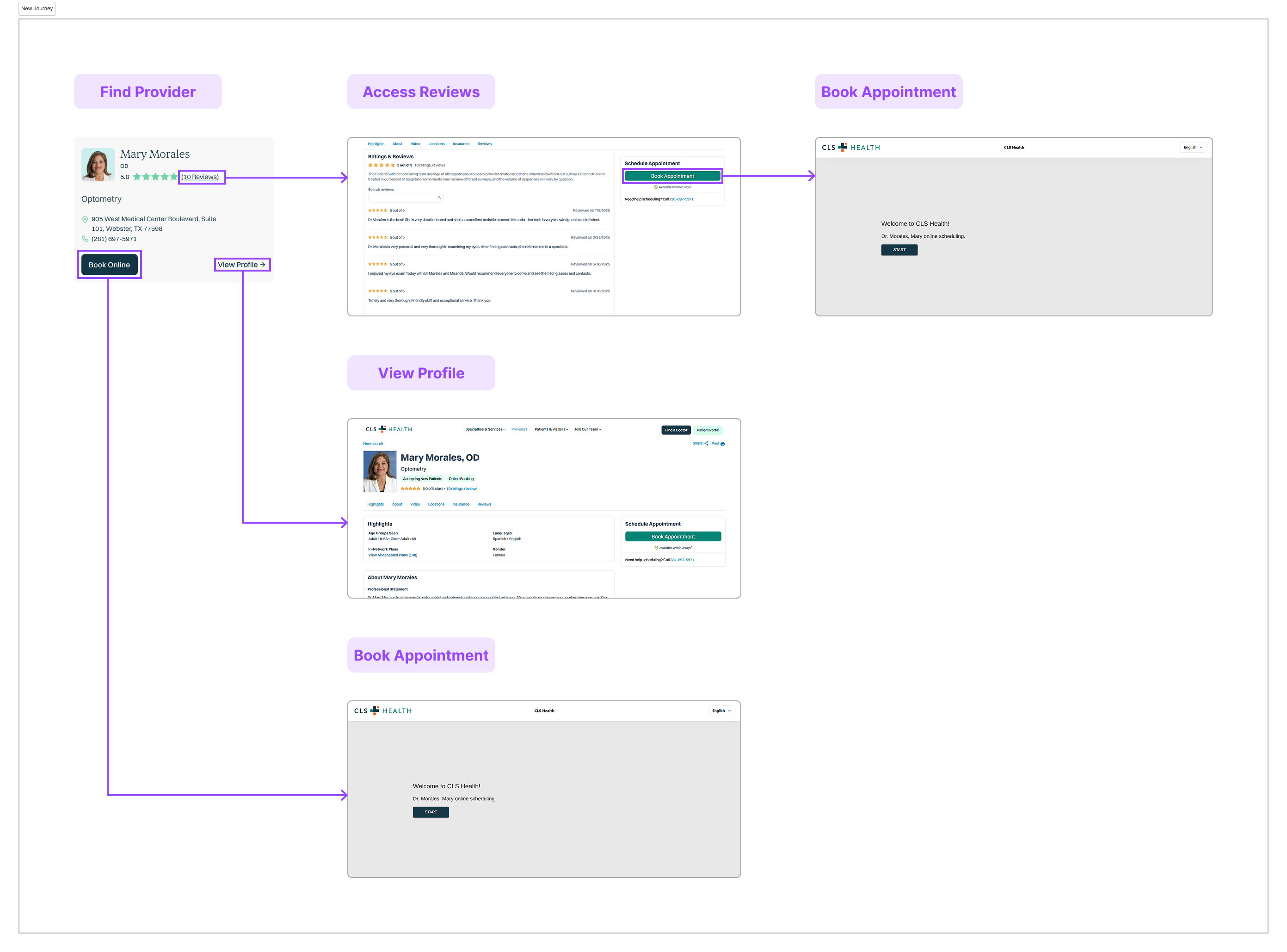
DESIGN
Critical information found along the journey that users most seeked was brought into the card architecture. Ratings are displayed along with review count that is directly linked to the review section on the providers’ profile. Specialty label is brought down to its own line to increase size and readability. Practicing address is added in to inform users to narrow their selection on providers relevant to their proximity. CTA wording was made clearer and action-oriented to better define and present end action.
Adding the missing layers
Critical information found along the journey that users most seeked was brought into the card architecture. Ratings are displayed along with review count that is directly linked to the review section on the providers’ profile. Specialty label is brought down to its own line to increase size and readability. Practicing address is added in to inform users to narrow their selection on providers relevant to their proximity. CTA wording was made clearer and action-oriented to better define and present end action.
1. Ratings & Reviews
![]()

2. Specialty, address, & contact number
![]()

3. Clearer CTA & online booking
![]()


TEST
After launching the new provider card, the design was tested and tracked how users interacted with the new design. The new provider card showed multiple, different paths users took to land in booking online. Shorter time in succeed rates were also reflected as booking paths shortened through direct CTA, pre-screening and selection made from provider ratings and location relevance, and fast-tracking to reviews.
Journey diversified and shortened
After launching the new provider card, the design was tested and tracked how users interacted with the new design. The new provider card showed multiple, different paths users took to land in booking online. Shorter time in succeed rates were also reflected as booking paths shortened through direct CTA, pre-screening and selection made from provider ratings and location relevance, and fast-tracking to reviews.
RESULTS
User-centric booking & provider exposure
Heatmap of the old provider card showed trends of users only engaging with the first provider on the list as the lack of information made users hard to filter and select providers within the list at one scan.
After the update with the new design, latest heatmap showed increased engagement with multiple providers and utilization of linked reviews. The subtle, micro UX updates on components led to a relatively larger impact on making the online booking process user-centric and empathy-driven.
After the update with the new design, latest heatmap showed increased engagement with multiple providers and utilization of linked reviews. The subtle, micro UX updates on components led to a relatively larger impact on making the online booking process user-centric and empathy-driven.